Showing posts with label Monhegan Lighthouse. Show all posts

Wednesday, January 6, 2016

Day 5 - Lighthouse Keeper's Roof

Lighthouse Keeper's Roof
6" x 6". pastel

I am always drawn to the angles of roofs and gables particularly red roofs in contrast to cerulean blue skies. Maine, and coastal places in New England and New York, are full of these combos.
This is the Lighthouse keeper's home (which is now a fascinating museum) on Mohegan Island, Maine. I spent a rainy dreary afternoon exploring paintings, photos, historic items and other ephemera of the island, and it's residents and visitors.

Sunday, January 25, 2015

Day 25 - 30/30 Challenge - Workshop w/Robert Kogge part 2

Here's what I did with my day. 


I started the larger version of Monhegan Keeper's Quarters late on Saturday and worked on it all day today – building the color and getting the structure right. Only at the end of the day did I start applying the ink washes.

I really love how you can simultaneously work on the smallest of details with the colored pencil and yet retain the soft focus created by the texture of the canvas. 
There's a lot more work to do on it! 
I'm looking forward to finishing it and entering it in The Art Guild’s next exhibit - 
Home on the Range – Landscapes we love.

This technique, colored pencil and ink on canvas, was developed by Robert Kogge, an artist from New Jersey. I first took his class at the Art Student League a few years ago. If you can't get to New York to take the class, you find it online at Craftsy.

Wednesday, December 10, 2014

Paintings Make Great Gifts! Part 4

I thought I'd highlight some paintings from Maine, Upstate New York and Rhode Island that are in my Etsy shop. These are smalls, most 6"x6" and all are under $50. Some are watercolor, some are pastel, some were painted plein air and some while not actually painted plein air, were painted from photos I took in in my travels.
I've included the links to the Etsy shop directly, as well as the original blog post about the painting.
They all come in an archival acid free clear plastic sleeve
They look fabulous matted and framed, but I will leave that you and your decor.
Thanks for looking!


This is one of the small out buildings at Pt Judith, Rhode Island.


We had a fun weekend in upstate New York – this barn was seen along the way.


Painted from the window of my hotel. It rained and rained and rained.


SOLD


Lobster Boat in New Harbor, Maine.


Somewhere in Maine


Beacon, NY


Saturday, March 8, 2014

Painting Updates: After School and Mermaids


(Prints are available for sale...somewhere...in storage...ask me if you're interested.)

Don't get your hopes up - I still can't show you the mermaid. Sorry :-(.  BUT I am taking pictures and writing notes about the progress so that at the end, when it's DONE, I can share the process, and the thinking behind it, with you.

Above is the VERY first poster the very first year of the festival! We stuck with this image for a couple of years. You'll see, in future posters, that we changed the look of the festival grounds through the years. The carnival eventually was taken out, a BIGGER stage was added, and the "craft area" moves to the other side. This was made easier because the four main pieces of the poster were painted separately – the festival grounds and water, the sky, the mermaid, and the moon. This was to allow me to change the proportions for ads in various newspapers, magazines, flyers and postcards (always different sizes and proportions). Some alterations were made only in photoshop and sometimes I had to repaint things.

I will show you a little more of the "After School" painting and how I solved a lighting problem.
(Click here to see where we left off.)

Here goes...

Here are a couple of close-ups of the painting with colors sort of blocked in.
I moved the sunflowers from under the window to the right to "cover" 
an electrical box on this corner. 

That chicken kept popping up everywhere. She was very inquisitive and bold.

As I said in the last blog post, the early evening became very overcast (and rainy) shortly after I sat down to work on this scene. When I started to work on it at home, I really wanted there to be some late afternoon/early evening color in the sky and reflected off the building. In pictures (taken when the sun was actually out on Monhegan) the northern sky is quite gorgeous with pinks and lavenders and the ocean horizon line is a cool blue.
Defining the trees and the sunflowers behind the chicken. 

I had to be careful to not make a blob of darkness in the dark areas of the pine tree/s and keep them interesting. The window screens are very dark too – darker then the other windows. But, this is sort of where I got stuck because my reference photo of the building is very grey – the western side is darker than the front of the building – and that's just not right if the sun is setting. Soooo what do I do?

I started looking through my other photos to find clues about the light. Despite the cloud cover, I was lucky enough to have been treated to late afternoon sun on my first day there. The goal was to find a similar building at a similar time of day. I found this picture of the lighthouse keeper's house in the late afternoon.
Granted this is looking south, with the west to the right, whereas the painting is looking north with the west to the left... 
but if you flip it...you can see the similarities more clearly. I did check Google maps to verify that the two buildings are at the same angle. (There's even a pine tree in nearly the same spot!)

Original photo (as a reminder): 

BIG difference!

Looking forward to painting those shadows behind the sunflowers (a la Sargent).

Tuesday, October 8, 2013

Hopper Drawings at the Whitney

Monhegan Lighthouse, 7am, Palette Study I
6" x 6", watercolor, $35
This will be in my Etsy shop soon - please contact me if interested


Monhegan Lighthouse, 7am, Palette Study II
6" x 6", watercolor, $35

Last Friday evening, I went to the Hopper Drawings show at the Whitney. As is traditional I go to a show as close to the end as I can - no reason - pure procrastination.

There were relatively few finished paintings. The majority of pieces were sketches and notes pertaining to the paintings as well as sketches for some paintings not represented and sketches from when he was a student.
Soire Bleu, 1914
Great character studies of Parisians from the early 1900s.

A few of the iconic Hoppers were there: Early Sunday Morning, The Nighthawks, Gas -


and some that I wasn't familiar with: New York Movie,

my new favorite - Rooms for Tourists. 
There were a couple of paintings from Cape Cod (one a watercolor in a very limited palette that I've seen before), 
(Route 66 Eastham)

(High Road)

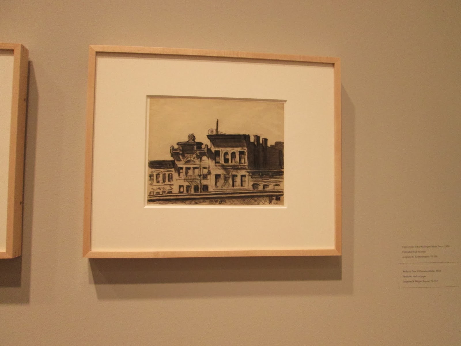
a few from the office series, some wonderful paintings of the tops of NYC buildings as he looked out his studio window,


nudes (not my favorites - though his model drawings are really wonderful),
(I love the notes. Study for Morning Sun)

I enjoyed seeing the process of Hopper's problem solving. The little sketches of salt shakers and fire hydrants, the way he worked out the composition in a theater or office, or the details of a shoe or gesture. The notes made on the drawing indicating the darkness of a shadow or the color of a roof.


(He went to several NY City theaters to sketch. There were many drawings of balconies and hallways,  and details of decor, as he searched for the perfect composition.)

(Details such as the uniform, right down to the shoes, are examined in a series of sketches.)

(His model was always his wife, Jo. She has the slightest smile here.)

(More note taking.)

(The docent told about the man who researched the background of this particular painting. 
He went to the hotel on Cape Cod and interviewed people. A few said that they were a little unnerved by a balding fellow sitting in his car across the street for long periods of time, day and night. 
That would be Hopper himself, studying and sketching.)

The above small watercolors are my (small) homage to Hopper - the first, a limited palette watercolor (cerulean, Prussian blue, alizarine crimson, quin gold and burnt sienna) and the second, an even more limited palate of alizarine, ultramarine and cadmium yellow.

What do you think of Hopper's paintings? Do you think that seeing the process helps to understand the painting and/or the artist's point of view?  Please let me know in the comments.